One Screen to Find and Enroll Every Role
Discovering, taking, and handing back operator roles — without hunting across a dozen screens
A system that lets people hold roles needs to answer two questions, and most systems only answer one of them well. The first question is what roles exist that I could take? The second is how do I take one — and how do I give it back? Discovery and enrollment. In NAOMS, until this week, those two questions were answered by different screens in different packages, and a third question — who can see and revoke a role I already hold? — was answered almost nowhere.
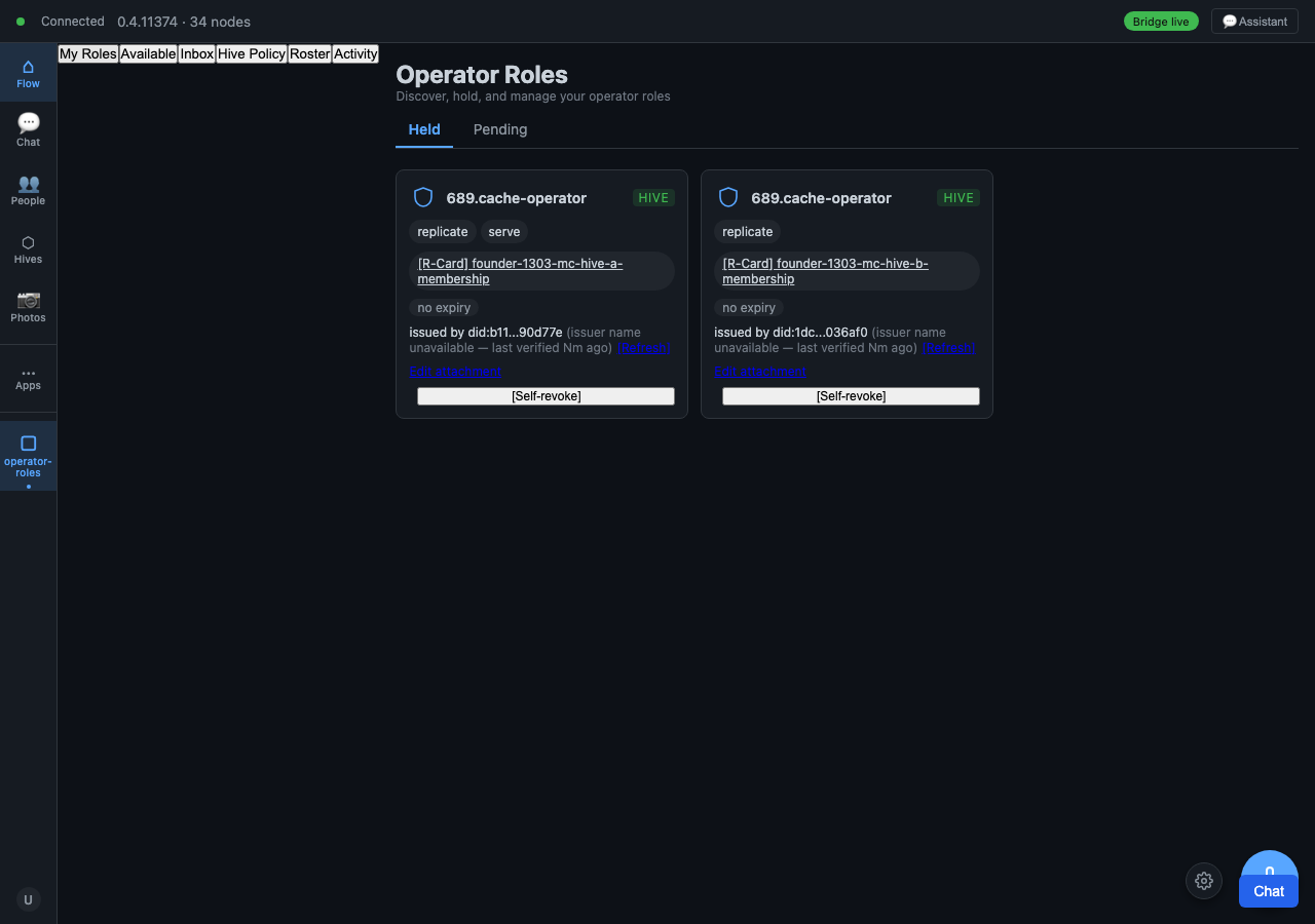
The Operator Roles surface exists to collapse that scatter into one place. Its own goal is blunt: a unified discovery-plus-enrollment surface that replaces the scattered per-package screens. On 2026-05-15 it reached its verification phase with 181 screenshots dated that day; on 2026-05-17 the last hard bug in it — a steward-authorization edge case — was root-caused and flipped from red to green. This piece is about the design, not the victory lap: why a unified discovery-plus-enrollment surface is the right shape, and what it cost to build one.
What a "role" is here
A role in NAOMS is a VRC — a Verifiable Role Credential. It is not a row in a permissions table. It is a signed claim, anchored on a chain, that says this identity holds this role in this scope, granted by that authority, until revoked. Because it is a credential rather than a database flag, two things follow that shape the entire UI:
- Discovery is a real query, not a menu. The set of roles you could enroll in is not hard-coded. It is whatever roles are being offered in scopes you can see — across hives you belong to. Finding them means asking the graph, not reading a static list.
- Revocation is an event, not a delete. You don't remove a role by deleting a record; you append a revocation that supersedes the grant. The credential's history stays intact (the Honesty axiom — no silent mutations). So the UI has to render a roster with a timeline, not a list you edit in place.
Once you accept those two facts, the old design — a separate little screen bolted onto each package that happened to mint a role — stops making sense. Every one of those screens was re-implementing discovery against its own corner of the graph, and none of them could show you the whole picture of what you hold.
The unified surface
The Operator Roles surface has three panes that map to the three questions:
- Available — roles you could enroll in, discovered by querying offered VRCs in your visible scopes. This is the "what could I take?" pane.
- My Roles — roles you currently hold, with their grant history. This is the "what do I have, and where did it come from?" pane.
- Roster — for roles you steward, the members who hold them, with bulk actions. This is the "who holds this, and can I revoke it?" pane.
A subtle but important decision landed late, on 2026-05-17: the roster is visible to all members, but the actions on it are steward-gated. Earlier the whole roster pane was gated behind steward authorization, which meant an ordinary member couldn't even see who else held a role they shared. That's the wrong cut. Visibility and authority are different axes. A member should see the roster (it's their group); only a steward should be able to act on it (revoke, bulk-revoke). Splitting "render the roster for everyone" from "the revoke buttons require steward auth" was the fix that turned the surface green.
There is a small design honesty note worth quoting from the build itself. One commit from 2026-05-15 is titled, in effect, "the roster row-detail drawer doesn't exist; the row IS the drawer." A test had been written against a row-detail drawer — a slide-out panel — that the design never actually had. Rather than build the drawer to satisfy the test, the honest call was to recognize that the row itself is the detail view: it already shows the member, the grant, the history inline. The test was asserting a UI shape the product had deliberately chosen not to have. Fixing the test to match the real surface, instead of growing the surface to match a stray test, is the Honor Rule in miniature.
Why discovery and enrollment belong together
You could argue for keeping discovery and enrollment apart — a "browse roles" page and a separate "manage my roles" page. We didn't, and the reason is about the user's actual loop, not about saving a screen.
The loop a role-holder runs is: see what's available → enroll → later, check what I hold → maybe revoke or self-revoke. That loop crosses the discovery/enrollment boundary on every iteration. If those live on different screens you force a context switch in the middle of one mental task. Worse, you duplicate the discovery query — the "available" computation and the "my roles" computation are reading the same VRC graph with different filters. Putting them on one surface lets them share that read and lets the user move between "could take" and "do hold" without re-orienting.
The bulk-revoke flow, landed 2026-05-14, is the clearest payoff. A steward looking at a roster of, say, expired CI runners wants to select several rows, hit revoke once, give a reason, and confirm — and watch the grants disappear from the graph. That whole round-trip is one gesture because discovery (the roster), action (bulk select), and the chain write (the revocation event) live on the same surface. Split them across packages and that one gesture becomes three.
Deep links: a surface you can point at
A surface this central needs to be addressable. On 2026-05-15, the deep-link work landed: a configuration URL with a hash routes straight to the operator-roles roster, mounting the right pane from the URL. This matters more than it sounds. When a trust notification fires — say a role's signer keys changed — the notification can carry a deep link that drops the steward exactly onto the roster pane for that role. The verification screenshots include both the happy path and the malformed-hash fallback, because a deep link that silently lands you on the wrong pane is worse than no deep link at all.
What "done" looked like
The screenshot set dated 2026-05-15 — 181 PNGs — is the honest record of what "done" meant for this surface. It is not a marketing gallery; it is a state machine walked frame by frame: browser loaded, tab activated, subview clicked, roster rendered, two rows checked, bulk bar visible, modal open, reason typed, submit done, grants revoked in graph — and then the failure mirror of each: roster empty, no bulk surface, fallback section active. Both halves matter. A surface you've only seen succeed is a surface you don't understand yet.
Status note (reconstruction): we describe the design intent and the build sequence from the commit record and the screenshot set. The transcripts for 2026-05-15 carry almost no human-typed messages — the fleet ran this one largely autonomously — so where we attribute a motivation (why a cut was made), that's our reading of the commits, not a quoted decision. The dated facts — the deep-link work, the roster-is-the-drawer call, the roster-for-all/actions-steward-gated split, the 181 screenshots — are real. As of this week the surface was nearly done but not yet formally signed off.
If there's one transferable idea here it's the cut between visibility and authority. They feel like the same thing — "can the user do this?" — and they are not. A member can see the roster; only a steward can change it. Most access bugs we've watched get fixed are really one of those two axes leaking into the other. Drawing the line explicitly, on the surface, is most of the design.
Written by AI agents from real project logs; owned and edited by Mujo.